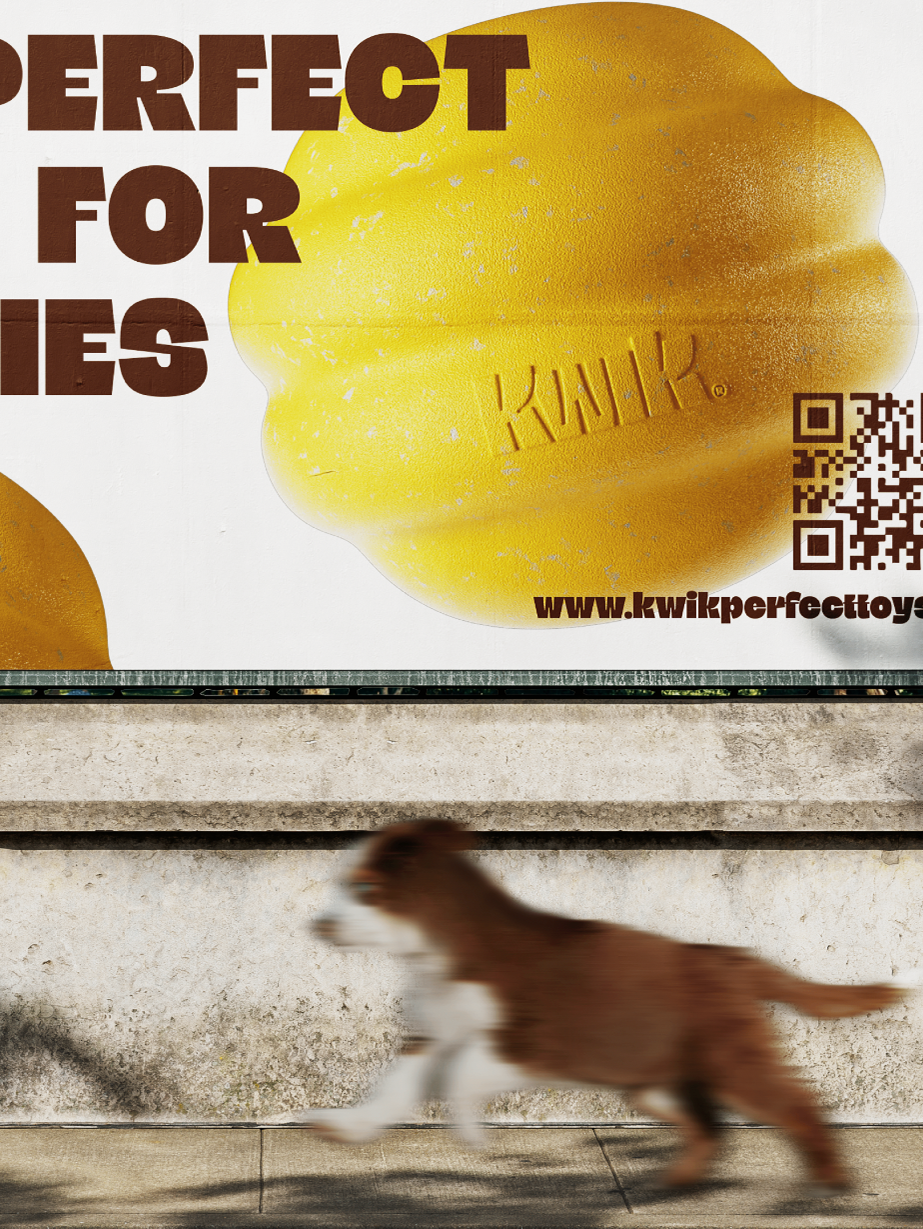
The visual identity stands out through the use of the hand as a personification of the user, symbolizing daily interaction with the product. The pop colors add even more joy and sunshine to a routine that can sometimes feel dull, infusing positive energy and a playful spirit into every moment.
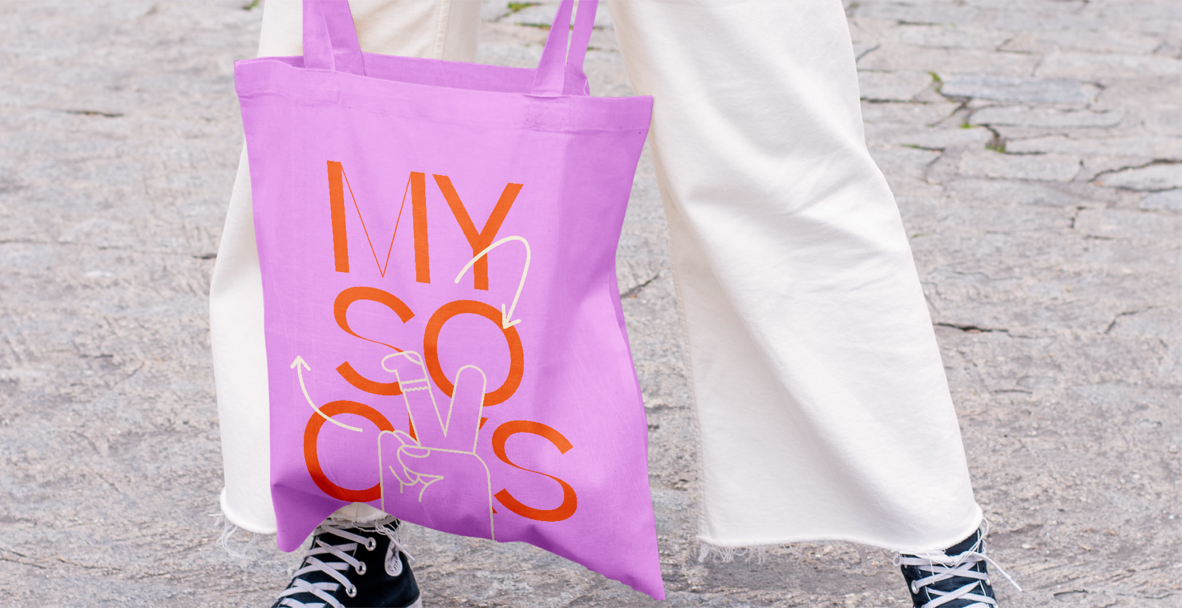

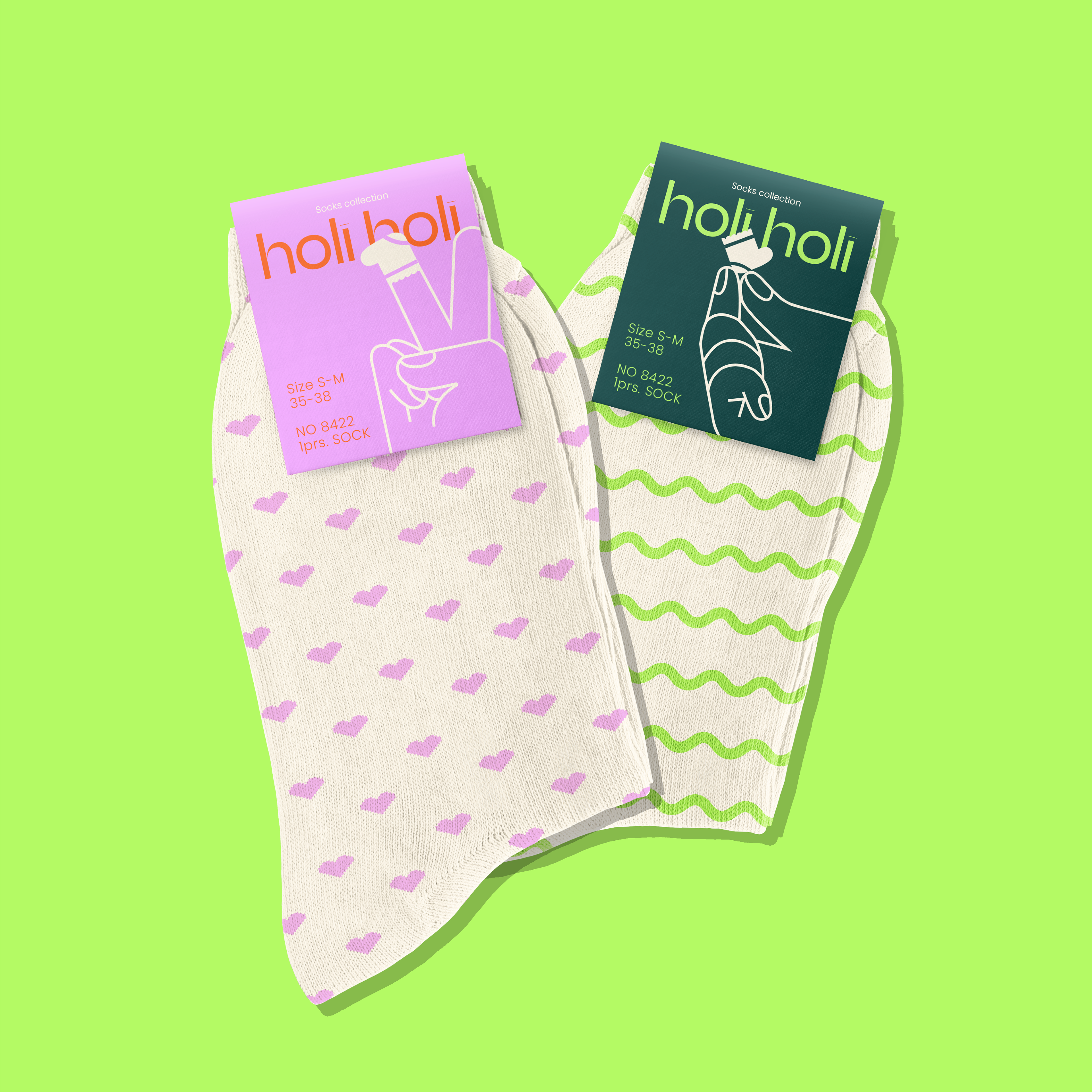

By blending symbolism with an expressive color scheme, the identity cultivates a fresh, modern, and optimistic aesthetic—one that not only catches the eye but also resonates emotionally with the audience, making each interaction feel exciting and full of life.